The Americans returns next month and talk has already centered on the very different political landscape we’re now experiencing than when the show debuted in 2013. Season 5 might be set in 1984, but right now The Americans seems more and more relevant and it will be interesting to see how/if this alters the viewing experience and how the creative team/stars will discuss these aspects while promoting the new season.
For now we can let the series of trailers FX has released focusing on “Best Show on TV” aspects (I concur) speak for themselves, about what we can expect from season 5 and if they are any indication then somehow the tension and stakes are going to be raised even further.
The first full promo focuses on Paige and how she is being brought further into the family business with self defense classes from her mother and the boyfriend who happens to be the son of Philip’s FBI Agent bestie. And here’s another of Philip and Elizabeth in full disguise playing a different couple at dinner discussing how they got together.
https://www.instagram.com/p/BQgFKxfgWEN/?taken-by=theamericansfx&hl=en
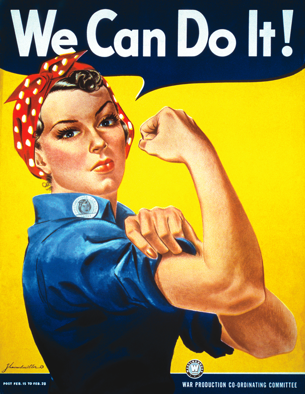
Now for the key art and every season takes on a new color palette. This is no exception and it is as bold as it is fabulous.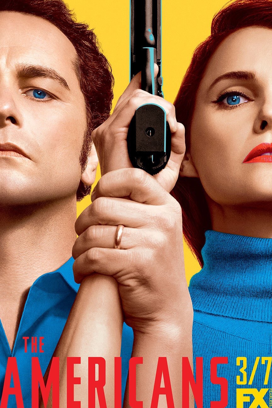 A color scheme that will standout on billboards/taxis/buses/subway stations and as per co-showrunner Joel Fields the inspiration behind this season 5 poster comes from Rosie the Riveter.
Yellow is such a striking and often ignored color when it comes to marketing unless there is something that points to the sun in the title; see It’s Always Sunny in Philadelphia, Eternal Sunshine of the Spotless Mind, Little Miss Sunshine. Or if the main characters are also this color; see Minions.
Combining it with two other primary colors is an immediate way to take notice and it is also somewhat jarring visually using such a cheery palette for a show that is this steeped in darkness. But it is also super effective and like a lot of Americans artwork it does read as propaganda and techniques from both countries have been utilized over the last five years (hence Rosie).
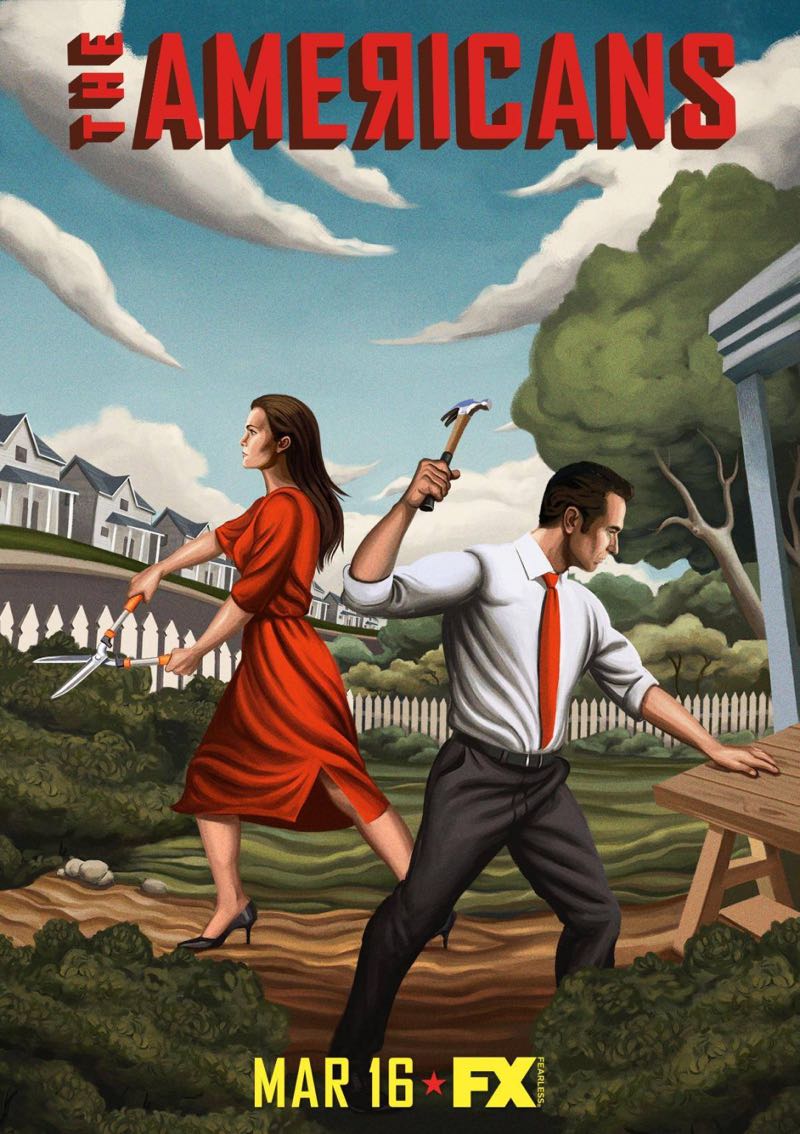
There is a sense of unity here and it is impressive that the FX marketing department has found ways of bringing out something different each year – season 2 is still my fave – even though it is always just Keri Russell and Matthew Rhys that feature on these posters.
This also strikes me as a smart idea as rather than throw in Paige training or Stan lurking there is always a sense that at the center of The Americans it is Philip and Elizabeth as spies and husband and wife.
Guns tend to feature making sure you never forget the nature of their work and there is always a sense of unity between them. Here in his hand clasped around her wrist – wedding band clearly on display – which could read as an act of control, but we know this to be sign of togetherness/partnership and their unbreakable bond. Plus Elizabeth is the one holding the gun.
To hammer (accidental USSR related pun) this point home they are dressed in matching blue and the blue of their eyes has been enhanced to complete this mirroring/togetherness. And even though they were physically apart in the final scene of the season 4 the look they share and everything that came before it reinforces just how strong they are as a unit. As does this poster.
The Americans returns Tuesday, March 7 on FX.

One Response to “The Americans Season 5 Key Art and Dining in Disguises”